
How Intuitive UX and Wearable Integration Boosted User Engagement

Mykyta Shevchenko
CEO & Co-founder
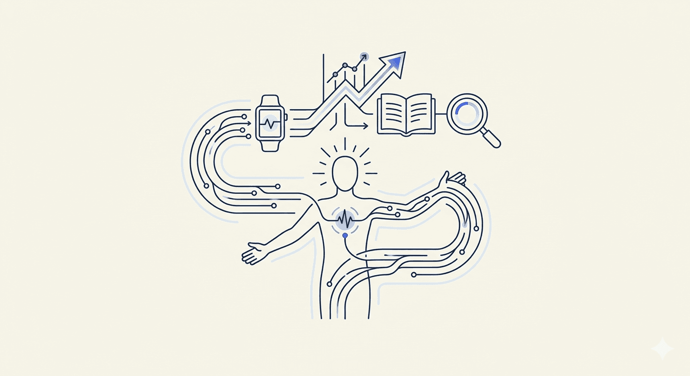
Wellness apps don’t usually struggle because they lack features. Many of them struggle because people stop opening them after the initial weeks. The problem is rarely technical capability; it is sustained relevance in everyday use. This case study examines how a wellness product reversed declining engagement by rethinking two fundamentals: how users interact with the interface and how health data is collected. Instead of expanding the roadmap with new features, gamification layers, or increasingly frequent notifications, the product team focused on reducing effort for users and improving the quality of data feeding the experience. The work centered on a UX redesign that removed unnecessary decisions from key flows and on a deeper integration with Apple Health, allowing activity and wellness data to be captured automatically rather than manually. Wearable data was treated as a primary input, not an optional enhancement, and the interface was redesigned to reflect that shift. As a result, users spent less time configuring the app and more time benefiting from it. Daily activity tracking became consistent, sessions became more frequent, and retention improved over time. Importantly, these gains were achieved without adding new functionality. Engagement increased because the product became easier to use, easier to trust, and easier to fit into daily routines.
The Challenge: Engagement Plateau in a Feature-Rich Wellness App
The client came to CipherCross with a wellness application that was already in active use. The product had been on the market long enough to move beyond MVP assumptions and gather real behavioral data. Functionally, the app was well equipped. It offered activity tracking, habit-building features, educational wellness content, and the ability for users to enter health data manually.
Early traction looked promising. Downloads were steady, onboarding completion rates were acceptable, and app store reviews reflected general satisfaction with the concept. However, deeper analysis revealed a consistent pattern: engagement dropped sharply after the first one to two weeks of use.
Product analytics highlighted several underlying issues. A large portion of users avoided manual data entry altogether, which left key features underutilized. Daily active users declined significantly once the onboarding flow was completed, suggesting that initial curiosity did not translate into routine usage. Users who owned wearables expected their data to sync automatically, but the setup process created friction that discouraged completion. At the same time, core UX flows asked users to make too many decisions too early, before the value of the product was fully clear.
From a business standpoint, these issues compounded over time. User acquisition continued, but retention lagged behind, driving up acquisition costs and limiting customer lifetime value. The app was functional, but it was not yet embedded in users’ daily behavior — a critical requirement for any wellness product.
Research Phase: Understanding Behavior, Not Assumptions
Rather than starting with visual redesigns or interface changes, CipherCross began the project with a structured research phase. The objective was to understand how the product was actually being used, where friction occurred, and why users disengaged — not to validate assumptions or aesthetic preferences.
The team combined several data sources to build a complete picture of user behavior. Product analytics provided insight into event flows, funnel drop-offs, and usage frequency across core features. Heatmaps and session recordings revealed where users hesitated, abandoned flows, or repeatedly attempted the same actions. App store reviews offered unfiltered feedback about expectations and frustrations, while short interviews with both active users and users who had churned helped clarify the reasons behind the observed patterns.
This research led to several consistent findings.
Users placed significantly more trust in data collected from wearables than in information they entered themselves. Manual inputs were treated as optional and were often skipped, especially after the first few days. Over time, this led to incomplete data profiles and reduced relevance of in-app insights.
The onboarding experience also created unnecessary cognitive load. Users were asked to configure goals, metrics, reminders, and preferences before they had a clear understanding of how these choices would affect their experience. For many, this resulted in guesswork rather than intentional setup.
Although wearable integration was technically available, it was not well supported from a UX perspective. Apple Health integration existed in the product, but it was difficult to discover, poorly explained, and easy to abandon partway through the setup process. Users who expected automatic tracking often assumed the feature was broken or unsupported.
Finally, feedback loops were too slow. Users could not immediately see how their activity data influenced recommendations or progress indicators. Without timely feedback, the connection between effort and outcome remained unclear.
These findings informed every subsequent UX and technical decision. The redesign was shaped by observed behavior and real constraints, not abstract best practices or trend-driven assumptions.
Strategy: Simplifying UX and Shifting the Work to Wearables
Following the research phase, the team aligned on a straightforward strategic direction. The product did not need more features or stronger motivational language. It needed to require less effort from users while making the value of each interaction clearer.
This direction translated into two concrete initiatives. First, the UX was redesigned to reduce cognitive load through progressive disclosure, allowing users to make decisions only when those decisions became relevant. Second, wearable integration was elevated from a secondary option to a core part of the product’s data architecture, with Apple Health positioned as the primary source of activity and wellness data.
Together, these changes aimed to make the product easier to adopt, easier to trust, and easier to use consistently.
UX Redesign: Making Everyday Use Frictionless
Progressive Onboarding
The original onboarding flow asked users to configure multiple settings before they had any context for how the app worked. Goals, metrics, reminders, and preferences were presented upfront, forcing users to make decisions based on assumptions rather than experience.
The redesigned onboarding was reduced to three essential steps:
Granting required permissions
Selecting a single primary wellness goal
Optionally connecting a wearable device
Everything else was deferred. Advanced settings and secondary goals were introduced later, only when users interacted with features that depended on them. This approach allowed users to enter the product quickly and learn its value through use rather than explanation.
As a result, onboarding drop-off decreased and more users reached their first meaningful interaction with the app.
Default Paths Instead of Empty States
Previously, many users landed on empty dashboards that relied on manual data entry to become useful. Without context or immediate feedback, these screens felt unfinished and were often ignored.
The redesigned UX replaced empty states with default paths that demonstrated value from the start. Dashboards included pre-filled sample insights that showed what the app would surface once data was available. Clear explanations connected specific data points to outcomes, helping users understand what actions would unlock which insights. Visual cues reinforced the benefit of continued use without requiring immediate input.
This shift helped users grasp the purpose of the app before being asked to contribute data, reducing early abandonment.
Fewer Screens, Clearer Actions
Several core flows were simplified by reducing the number of screens and decisions required. Multi-step interactions were consolidated into single-screen experiences for:
Activity summaries
Daily check-ins
Progress reviews
Each screen was designed to answer one question only: what is the next relevant action? Secondary information was either removed or made accessible on demand. This clarity reduced friction and helped users move through the app without hesitation.
Wearable Integration Wellness: Apple Health as a Core Data Layer
Instead of treating wearable integration as an optional enhancement, CipherCross repositioned Apple Health as the primary data layer for the product. This shift reflected observed user behavior: users trusted wearable data more and expected it to work automatically.
The integration covered key data points, including steps and distance, active energy expenditure, sleep duration, and heart rate trends. Data syncing occurred in the background, without requiring repeated user input, and was supported by clear explanations of how the data was used within the app.
Several UX decisions proved critical. Permission requests were written in plain language, avoiding technical terminology that could raise concerns or confusion. Sync status was always visible, so users could see whether their data was current. At the same time, the product was designed to function without a wearable, ensuring that users who chose not to connect a device were not blocked from core features.
This approach improved user trust and significantly reduced support requests related to missing or inaccurate data, while reinforcing wearables as a reliable foundation rather than a fragile add-on.
Turning Raw Data into Meaningful Feedback
Collecting user data alone does not drive engagement. The value comes from interpreting that data in ways that are immediately understandable and actionable for the user. One of the key focuses of the UX redesign was ensuring that feedback was timely, clear, and relevant to individual goals.
Rather than presenting multiple metrics at once, the app delivered focused insights that users could act on. Daily summaries highlighted a single key takeaway rather than a collection of numbers. Weekly reports emphasized trends over raw counts, making it easier for users to see progress over time. Recommendations were tied to specific wearable data points, such as steps, heart rate, or sleep patterns, and always explained how this data related to personal wellness goals.
For example, instead of simply telling a user they walked 7,234 steps, the app contextualized that number relative to their individual goal, explaining whether they were on track or needed to adjust activity to reach their target. This approach improved comprehension, increased the perceived value of the app, and encouraged continued engagement.
Results: Measurable Impact on Engagement
The redesigned app and deeper wearable integration were monitored for three months following rollout. The results were significant and measurable:
Daily active users increased by 38% compared with the pre-redesign period.
Retention among wearable-connected users increased by 52%, indicating that automatic data syncing reinforced ongoing engagement.
Manual data entry dropped by 61%, reducing friction and making the app easier to maintain for users.
Session frequency increased, even without relying on push notifications, demonstrating that users found value in opening the app on their own.
These improvements were achieved without adding new features. The gains came from simplifying UX flows, improving clarity, and integrating wearable data in a way that felt natural and reliable.
Lessons for Product Teams
This case provides practical insights for different stakeholders in wellness product development:
For CEOs:
Engagement improves when effort decreases. Investments in UX design and robust data infrastructure deliver tangible returns in retention and lifetime value.
For UX/UI Designers:
Effective wellness UX is not about motivational messaging or visual polish alone. It is about removing unnecessary decisions and presenting actionable insights at the right time.
For CTOs:
Wearable integration should be built as a reliable, scalable data backbone rather than an optional or fragile plugin. Automatic syncing and transparent feedback significantly impact user trust.
For Product Teams:
Behavioral data collected automatically from wearables is more reliable and actionable than self-reported data when creating personalized experiences. Designing with this principle can improve engagement without increasing feature complexity.
Common Pitfalls Avoided
This project intentionally avoided several common mistakes:
Overloading dashboards with too many metrics, which can overwhelm users.
Treating wearable integration as optional rather than central to the experience.
Forcing personalization choices before establishing user trust.
Offering generic wellness advice disconnected from actual user data.
Avoiding these issues was as important as the solutions themselves, ensuring that improvements would have lasting impact.
Why Cipher Cross
CipherCross specializes in building user-centric wellness apps that balance clarity, security, and scalability. This case illustrates our approach:
Research-driven UX decisions based on actual user behavior.
Responsible handling of health data, with transparency and security in mind.
Scalable integrations with platforms such as Apple Health to ensure reliability and consistent value.
Final Thoughts
Wellness apps succeed when they integrate naturally into daily routines. This case demonstrates that careful UX design and seamless wearable integration can produce measurable engagement improvements, even without adding new features.
If your product experiences engagement challenges despite functional capabilities, the limiting factor may not be the feature set, but the way users experience the product.
Request a UX audit for your product
CipherCross can help identify UX friction points, highlight underused data, and provide actionable recommendations to improve engagement and retention.
Dive into our diverse articles – from wellness app design and AI personalization to software development best practices, operational workflows, and strategic guidance.




Load More