
Engagement That Lasts: How to Design Wellness Apps Users Actually Stick With

Volodymyr Irzhytskyi
COO & Co-founder
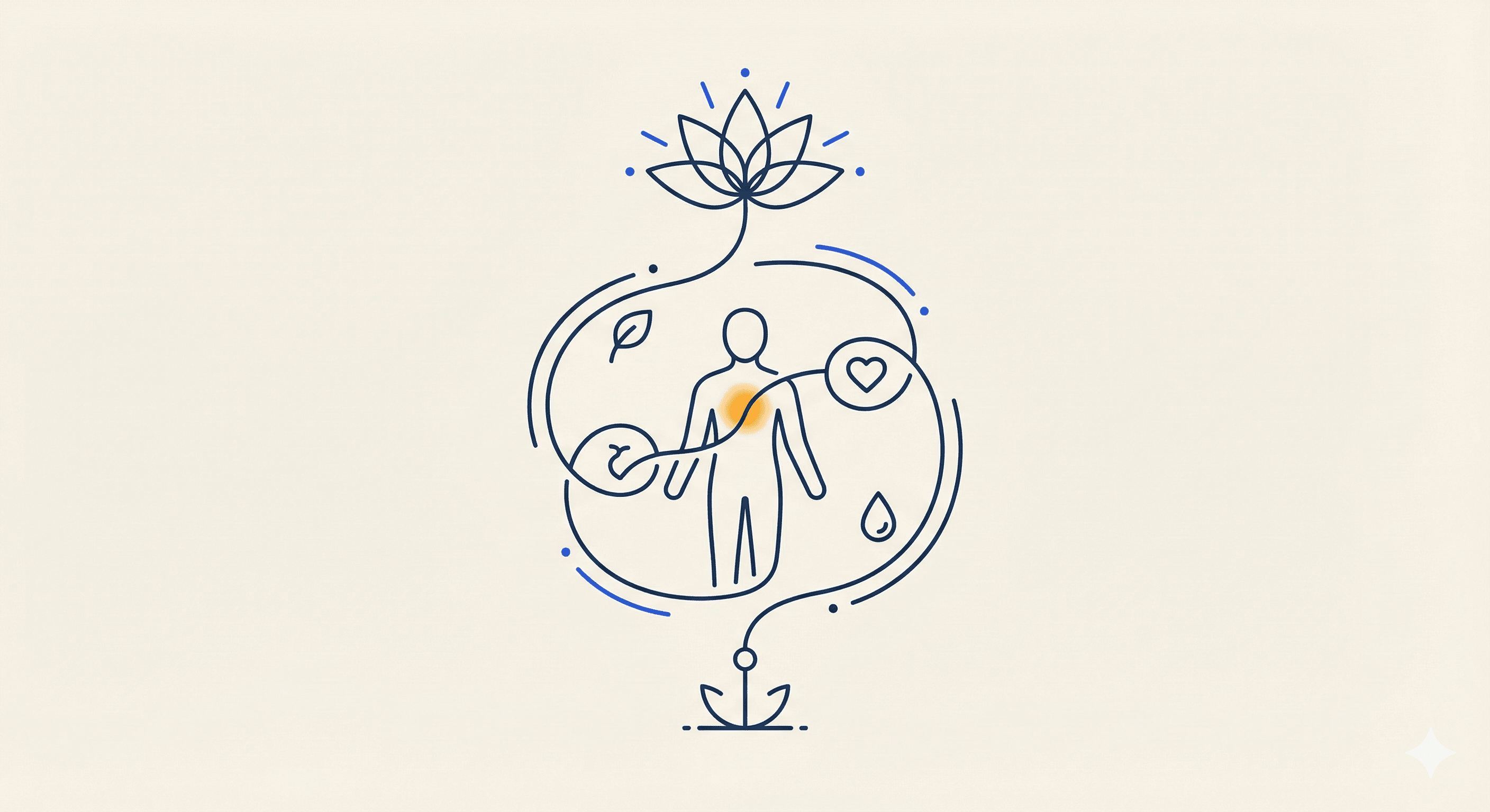
After installing a wellness app, the hope with which you start leaves you with only a good feeling, and when no sickness follows suit, you have sweeter dreams, live longer per day, spend energy, or eat healthily. But most quit within days. Good intentions soon grow faint when the product seems heavy and confusing or cold. Requirements for Success Design can change that. It is not just the look of the app but the support it provides to people from one day to the next. UX for wellness is not just about quick wins. It is more about building trust, making small habits comfortable, and responding to genuine human needs. This article examines how to build lasting engagement. It focuses on concrete UX and behavioral design strategies that help people connect to their goals and the product you offer.
Why Retention Is the Real Metric
While care delivery may be more effectively enhanced by technology, the essence of care remains fundamentally human. Digital applications must always try to facilitate, rather than replace, face-to-face relationships. For example, a wellness application provides a reminder for a person to go out and do physical activity. But the doctor gives you the rationale. Although an application may keep up with one's emotional state, it is a therapist who lets people process feelings. The human factor brings essential context, compassion, and connection.
Digital instruments can help healthcare professionals make their interactions more meaningful by freeing them from routine tasks. When the automatic Data Collection Routine is used, the conversation is about analysis, not paperwork. Patients arrive with information that solemnly reflects what they have been through. The result is improved outcomes for both parties. The Application encourages those it serves to continue to be supportive partners in their own health journey, while the professionals come up with necessary guidance on this basis.
In moving its care models from in-person to hybrid, the organization followed the principle that technology is to assist in arduous work, even if it might get in the way.
Start With Emotional Fit
Every person's path to wellness should be made just for them. Our users bring their feelings and sentiments to the service, as well as their goals. They might feel tired, overwhelmed, or uncertain. If their first experience of the app is not welcoming and lots is asked from them instead, they will likely leave. The great user experience (the apex aim of design) needs empathy. When a new user opens this app for the first time, what emotions does he or she have to endure? Solving verbal fumbles now and then will save you untold suffering between friends!
Remember that there is always someone on hand to help with your unspeed metal trap. A straightforward and transparent tone brings anxiety down. It's vital to present simple steps, using exactly as much English as the user needs and avoiding information overload (don't put too many words down at once).
Give users a little success immediately—that they can do right now rather than postponing to garner applause later. When we take a user-centered design approach like this, the feelings of users resonate with what the app expresses. Gradually, trust develops as people feel that their needs are understood well by the service.
Clarity Over Complexity
It's a well-known fact that voyaging to well-being is a complex journey to navigate. To this end, the design should be aimed at easing procedures. Health-seeking applications never seem to meet their goals, because they can be a jumble—users see countless keys, many options, and a string of information all at once. Result: Inaction, as people are unsure of how to start
The main points in creating an experience of clarity for users include:
A lesser road for beginners.
Tangible evidence that you're getting somewhere, visible in the first session
Flashes of silver lining, grants of encouragement on the way in recognition of minor milestones passed.
A clear scheme tells users, "You can do this too." Too many new elements together; gradually introduce complexity. If people understand where they are now and what they should do next, they are likely to hang in; if they get confused, however, you will find it hard to keep them.
The Role of Behavior Loops
Habit formation is a circular process composed of three components: a cue, an action, and a reward. This proposed one is based on behavioral science, fits neatly with the principles of user experience (UX) design concepts. It is up to the application to provide cues and positive feedback. It may be an access point for some power users, while others who do not require high-frequency safety alarms would naturally take to the idea of turning their own canned responses into discreet pop-up messages that imitate one-touch actions.
Cues are reminders of the next step to take; common examples include simply having someone point it out to you, a morning message, or even the first thing in your day. Write down the book that will be read later.
Actions cover specific tasks. For example, practicing breathing exercises, jotting down luck or misfortune in personal diaries, and the number of luck/mystery winners for yesterday's windfall drawing.
Rewards refer to the benefits you gain. They are not just points but rather a feeling of progress with your skin and entering into tranquility as an experience.
With each repetition of this cycle, habit takes over and becomes part of how users live. Designers can encourage people to practice it by tying the actions people in their right mind do spontaneously with other triggers in everyday life, such as setting the alarm clock before bed, lunch opening time, and waking up at intervals. This ongoing rhythm is self-reinforcing.
Onboarding as the First Habit
It's not just a simple introduction to living well that this first session is for. Experiential learning should be the approach taken during onboarding. Rather than asking the user many questions, it should focus on helping people achieve a small success in order to increase their understanding of how your application works. Take them for a walk into all its nooks and crannies themselves. For example, when they start a soothing meditation app, let them try one breathing exercise first. If you focus on health, let them list one meal to eat tomorrow, and consider what the system tells us about this.
The ability to achieve an early win lays the foundation for confidence and trust. At the same time, wear globally. It is a poor practice. Thanks to the programmed procedure aspect, you could see response rates improve dramatically.
Do not present elaborate forms at this stage or ask for too much information; you can always request that later when the user has already established a value for experience.
The point of the matter is: during that all-important first session, one should forsake the people only a win. It is this positive memory that encourages users to come back for future sessions.
Design for Real Life, Not Ideal Life
Health apps often seem to assume that people are picture-perfect and wake up at 5 am, follow a schedule closely, never fail, and so on. However, reality is quite different. People skip days, break their streaks, and succumb to a pop in motivation. Both also pointed out that a well-made app would not penalize but encourage recovery.
UX design should make friends with the idea of not being perfect. You can also add soft nudges like “Glad you’re back” or “Start anew today” to give users the nudge they need to restart without guilt. Tracking progress must be adaptable. It ought to emphasize trends, rather than streaks, and reward consistency as much as it demands perfection. User retention is based on a design that practices forgiveness. Life is unpredictable, and users need a way back without shame.
Delicate design details have a huge impact on the way users act. For example, a button that gently glows after you do something, or an auditory response to indicate success, can greatly add to the experience. Being a little more conversational, like asking for them to be “Done” instead of “Submit”, can also help make the interaction feel more positive. These are the kind of microinteractions that matter: it’s these otherwise insignificant actions that can help behaviors feel subconscious and second nature.
Emotions are important and instrumental in well-being experiences. Each exchange with a user boosts or detracts from a user’s morale; cold, thoughtless exchanges can drive users away, whereas heated experiences will encourage continued participation.
Designers must systematically consider every single detail—not only for usability but also as a “touch-point” of emotional response. Such as whether tapping feels rewarding or if a message is relieving stress. There is so much to engage with in these delicate moments.
Progress Without Pressure
Gameified streaks can help some, but they can lead others to feel ashamed of themselves: A missed day, it turns out, is a horrible thing for morale. Rather than focus on perfect line records, good design should show trends and personal journeys. For example, instead of saying “You lost your streak,” a more supportive way could be “Wow! You’ve practiced four times this week — that’s an amazing level of consistency!”
Visuals showing gradual progress—such as a circle that fills in slowly, or a calendar marked with mild cues—can help motivate. The speech as a whole needs to be one of support, not judgment; you don’t keep people around by making them feel ashamed, but by feeling like they’ve added something which improves everything. Personalization is key to creating connections with users. But in the wellness realm, this shit is our sensitive sleep, stress levels, and emotions we’ve been feeling. Govern your trust accordingly! Any form of good personalization is based on the data users give, not the guesses systems make. So, for example, if someone is tracking how they feel, the app will reveal patterns that seem relevant; if someone logs meals, the app will provide meaningful feedback too.
Avoid intrusive suggestions or unnecessary assumptions; transparency improves safety, with an explanation on how the user’s data is used. Simple control mechanisms – like “stop reminders,” “adjust goals”, or “pause tracking” – put users in the driver’s seat and help them feel vested with the app. This kind of ownership drives higher engagement, as users start seeing the app as part of their persona.
Some people want human interaction, and some prefer leaving them alone; therefore social features can help with retention provided they are tactful. Open forums can be intimidating or lead to dangerous comparisons; smaller groups or facilitated sessions have a better chance of making connections feel safer. If you add social features, it’s also important to have guidelines: Special moderation tools should be offered, clear information about participating should be available, and content preferences for users who do or don’t want to participate – they are must-haves.
A supportive space should foster reflection, not competition; group goals ( “7 days of calm”) are generally more effective than competitive leaderboards. Creating safe relationships results in a sense of membership that motivates continued participation and brings people back again for more support and development.
Motivation Shifts Over Time
Development is a powerful force of progression. Though individuals have an eye for growth, excessive demands on their well sparks off hesitancy.
While gamified streaks might suit some users, they can push the rest of us into embarrassment at any slight slip in morale. Effective design should not target an audience of perfect record-holders but rather focus on bigger issues, such as trend lines and personal journeys. Take it in this way instead. It would be more encouraging to say: "You have had four practices this week–a very steady performance."
Visual forms that represent steady progress–slowly filling in a circle or perhaps a calendar where people look for tiny signs–can motivate others to clap along. People generally appreciate this kind of supportive tone rather than a harsher one; when people feel proud rather than penalized, their retention rates increase.
Personalisation plays a crucial part in the establishment of a bond between user and user. However, personalized services in the field of health often involve such sensitive issues as sleep habits, stress levels, mood states, or anything else, where trust is all the more precious. Suitably personalized attention relies on the data contributed by users themselves instead of making assumptions through the system. For instance, if someone records their mood, that's what the app should show; if they log meals, it should give them good tips.
To avoid undue recommendations that interfere or make unwarranted assumptions, it is very important to build transparency so that users can clearly understand how their data is being used and for what purpose. Offering straightforward ways for users to control their experience with the app–such as "turn off reminders," "edit goals”, or "pause tracking"–both empowers them and enhances ownership. This result is greater engagement as users come to see the app itself as an extension of their own personalities.
Some people need connections, while others value their privacy too much: community features can improve retention rates if you handle them wisely. Open forums can swamp readers into overstimulation or lead to unhealthy comparisons; smaller groups and guided sessions enforce a more benign atmosphere for discussion. When incorporating social features, it is essential to draw boundaries by offering moderation tools and clear rules, as well as the user's own preferences in taking part.
A community that supports each other should breed introspection as opposed to competition; collective goals such as "7 days of calm" are generally more effective than competitive leaderboards. Once safe connections are built, there is an atmosphere of belonging that encourages continued participation and return. Users come back for continued support and growth.
Design for Moments, Not Hours
Healthy habits are often built in small moments. Whether it's doing a quick stretching exercise, taking a single deep breathing break, or writing something down, such activities can be very effective. That's why app design should offer a format that fits these rushed time periods. Short interactions are the hallmark of easy reproduction, and repetition is the source of eternal habit. If an app demands big chunks of time from users, then gently guide the user through each session and remind him or her about its worth. However, don't assume that users can keep up prolonged focus day after day.
Users are more likely to stick around for a while if your app is tailored to their natural rhythms and doesn't try to force them onto a new beat of its choosing. With this movement towards digital health, wellness applications will increasingly integrate into clinical care--with raised user expectations following along accordingly.
Designers must bring feelings and facts into harmony: wellness products need to be relatable yet still uphold health standards. The nexus of behavioral science, data ethics, and emotional design will hold the key. Ultimately, sustaining user attention will depend both on expressiveness and proof. The best applications will not only pay attention to keeping streaks alive but rather establish an environment in which users can be themselves in real life, meaningful engagement that will last.
Conclusion
Sustained engagement is all about mutual respect. When an app complies with what the user wants and doesn't push them too hard, people are more likely than not to continue using it. If it feels safe instead of delusional or terrifying, people also come back again and again.
A good user interface (UI) should not transform people overnight but rather adapt itself to the person as he is. It lets one make a small amount of progress at a time, allows some room for failure, and provides assistance toward continual improvement.
By making your design an act of listening rather than just telling, people are inclined to return time after time. This can help to establish trust and stabilize habits into something more like a routine. That's how fragrance and fashion, as well as other wellness- and health-related ideas, can have a real impact on consumers.
Cooperate with CipherCross to create digital wellness solutions that are user-centric.
Dive into our diverse articles – from wellness app design and AI personalization to software development best practices, operational workflows, and strategic guidance.


Load More